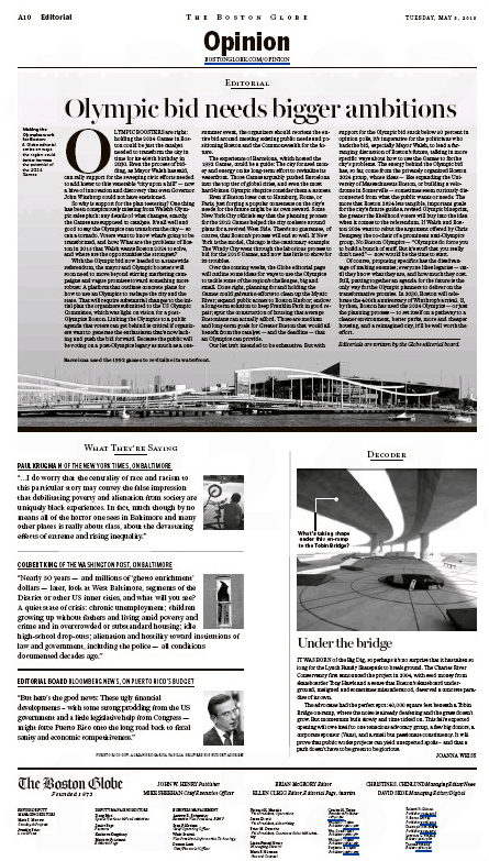
As the masthead warned us, the Boston Globe has freshened up its editorial/opinion pages for whatever reason (maybe a focus group?).
From yesterday’s edition of the stately local broadsheet:
Modern! Easy! Excellent!
Today’s edition of the Globe features the great unveiling. Left-hand page:
Right-hand page:
So, for example, Decoder, the explainer with a point of view, quite logically starts out with the umpteenth example of Boston as the Can’t Do city.
Under the Bridge
IT WAS BORN of the Big Dig, so perhaps it’s no surprise that it has taken so long for the Lynch Family Skatepark to break ground. The Charles River Conservancy first announced the project in 2004, with seed money from skateboarder Tony Hawk and a sense that Boston’s skateboard underground, maligned and sometimes misunderstood, deserved a concrete paradise of its own.
A mere ten years later, Joanna Weiss helpfully points out, construction finally started late last month.
And etc. You can check it all out here.
One thing that struck the hardreading staff: Only one editorial instead of the two or three in the old, unfreshened format. That, of course, might change. We’ll see.
But this also strikes us: The hardy few readers who actually do venture onto the opinion pages of the Globe are almost assuredly more interested in the content than the packaging. We’ll see about that as well.


After careful and thoughtful review, it stinks.
Space is always a premium at a newspaper. Always, especially in these digital times.
On the first editorial page, a full quarter of the page shows a photo of a space underneath an overpass, showing where a proposed skateboard park will finally take place. Stop the presses!
Another quarter of the page is devoted to “what they’re saying,” with pull-out quotes from other newspapers and sources. Note to Globe:
a) I buy the Globe to learn what its readers, op-ed writers and columnists have to say. If I want to learn what other papers are saying, I can go to Google to find out.
b) Your choice of “what they’re saying,” is odd, to say the least. One bit is a quote from an editorial from Bloomberg News on Puerto Rico. Here’s the entire quote: “But here’s the good news: These ugly financial developments – with some strong prodding from the US government and a little legislative help from Congress — might force Puerto Rico onto the long road back to fiscal sanity and economic competitiveness.”
Gee, thanks Globe. Now I can sleep better tonight knowing Puerto Rico is on the long road back to fiscal sanity.
In other words, the new editorial layout is a mess, with too much white space as well.
I think that’s what happens when “content providers” and “edgy designers” get in the way of good, common sense newspaper writing and editing.